Front cover:
This is to be included on the front and spine of the digipak. However I am aiming to keep letters and wording minimalistic on the front cover of my digipak, for example:
This CD cover has a small amount of wording on it's front in the bottom right corner just enough to tell the view which band and album it is and this is ideal because the picture is relevant to the band's name which creates a good representation, however I am not looking to create something as big and intricate as this, it is still a step along the lines of what I am looking for to create my digipak, through the patterns and swirls that create a scene within a scene.
The layout is in a way what I am looking for in my digipak, as I want the name of the band to be out of the way of the actual picture, in the corner of the cover or along the bottom so the words have a small effect on the picture, and the viewer's eye is firstly attracted to the picture and not to the words.
What I am not looking for is an album cover that revolves around wording to carry it's message across, attract the viewers attention and tell them which band and what album it is.
For example:

This is what I believe to be a bad album cover as it resides on words and nothing else, although the words are in a strange and erratic font with different colours which possibly make it attractive to some audiences I would deem this as quite bland and an everyday type of album cover.
Spine:
The spine is where I am aiming to put all of the relevant information to tell the audience what band and what album it is:
For example, this digipak has a minimalistic front cover in terms of wording with it being only on the top and bottom of the front cover instead of within the picture, and has an eye catching picture on it's front, whereas its spine contains all of the wording to tell the viewers which band and album it is.
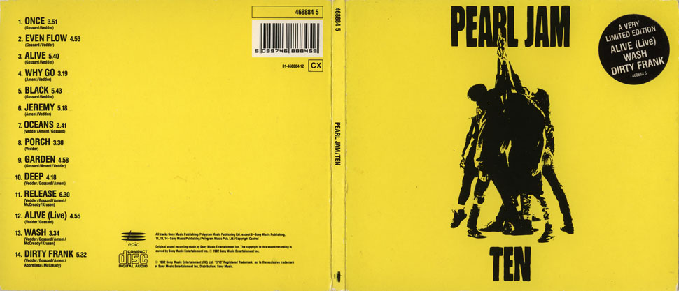
Track Listing:
I am aiming to put this on the inside of the digipak on one side as associated with the picture above, although I would like to put some intricate designs behind the list of tracks to make it more appealing, but many artist's digipaks have only a blank page as shown above with a list of songs contained within the CD.
Although one possible idea is to free up space on either side and put the tracks on the actual disk itself. For example:

This digipaks uses the disk for it's track-listing and in doing so frees up space on the other side for messages and notes etc.
I believe that using the disk for track-listing may be more useful than putting it on one of the side pages.
Barcode:
The barcode is most common on a digipaks and is located in the bottom corner on the back of the digipaks, it is essential if it is to be sold in stores:
The barcode is usually always situated on the back of the digipak but can either be at the top or bottom corners.
Parental Advisory:
This image is only given to digipaks and albums which contain inappropriate content for those under the age of 16:
It is usually for explicit lyrics, so anything containing drugs, sex, violence etc.
Image of the artist/image that suits the genre:
Digipaks can contain either of the two or even both, for example the picture situated above represents an image of the artist and also an image that suits the genre as the big words 'Lunatic' at the top show the type of mood the artist is going for which is insanity or angst and furthermore shows this through the minimalistic use of colours, black, white and grey.

For example, this CD album has lots of different little designs and figures on it, with many different colours and differing levels of intricate patterns. In my eyes this would attract more people than the one above due to it's brightness and complex design.
These three CD covers show each individual artist from the band Green Day.
In my opinion I believe that releasing three individual albums with each of the artist's faces on is a way of increasing publicity and sales, but it is also designed for brighter colours in order to attract an audience, even though Green Day's genre is more along the punk rock line.

 Record company information:

You can usually find the record company information on the back of these albums, for example:
"ELEKTRA ENTERTAINMENT GROUP, INC."
"Warner Music Group
An AOL Time Warner Company
75 Rockefeller Plaza
New York, NY 10019
Pinnacle Building 3400 West Drive
Street 2nd Floor,
Burbank, CA 91505"
This information is usually on the back of every CD cover giving the recording studio and it's address.
All CD covers should also have copyright information on the back of their albums such as the one above:
"Copyright 2003 Elektra Entertainment Group Inc. for the United States and WEA International Inc. for the world outside of the United States. Warner Music Group. An AOL Time Warner Company. All rights reserved. Printed in U.S.A WARNING: Unauthorized reproduction of this recording is prohibited by Federal law and subject to criminal prosecution."
Most albums also give instructions on its usage as well as system requirements and extra information about the band itself, e.g. websites to look up upcoming releases, tour dates and locations etc.


