Genre:
 The genre that we decided to use for our music is indie/alternative rock as we think it is quite a niche music genre but is also very unique in its artwork for album covers.
Lettering/font styles and sizes:
The lettering and font styles we are aiming to use for our digipak are surreal and unique types of fonts which show off our actual genre within our music. The actual font used on the Cage The Elephant album cover is unique by the fact that it is not neat or tidy and looks messy as if a child wrote it. Tis is also influenced by the paint around the sides. The size of the font also is not big enough to take up lots of space and not small enough to be difficult to read, meaning it is not the entirety of the album cover and leaves plenty of space for an eye-catching image. However there are exceptions to this:
Although the artist's name takes up quite a lot of space on the CD cover it is also integrated into the artwork which for me increases my interest in that album instead of it deterring me.
Image:
For my album cover I believe that an image of the artists is not a good idea to include as it is unoriginal and I deem it as quite lazy, for my album I would like to create an image of authenticity to the types of songs as well as something unique and interesting to the audience.An example of this is:

Stars/Icons:
Because this music genre is quite unique within its artwork it is uncommon for the artist to just post a picture of him/herself, but usually they would portray themselves in some sort of way, for example:
To me this shows some effort has been put into his album cover as it makes his unique, because not many artists portray themselves as mermaids.
This challenges the audience's perspective on Psy, because he has shown that he is passionate about his music not only through his songs but also through his artwork.
Representation:
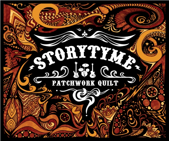 Artists are represented in different ways within this msuic genre, as it is seen as quite niche most artists have to do more to be noticed, or to attract public interest, this means using different techniques with art, such as using more intricate designs, attractive patterns or textures, etc.
Such as this album cover, it's design is so unique and intricate in ways such as it being eye catching to an audience seeking to buy an album.
Although I would not want my digipak to be as complex as this due to a matter of time issues, the patterns and textures used on this album cover compliment the artists name "patchwork quilt" as patchworking is seen as using a lot of detail and time to complete.
Audience:
The audience for the alternative rock/indie genre are stereotypically seen as regular people who do not like mainstream music such as pop but prefer an entirely different section, artists within this genre know this because they often portray their artwork and their band name towards their liking as these artists can often relate to being a member of the audience.In conclusion:
The genre is indie/alternative rock.The lettering and font size/style has to be relatively big, but not big enough to take up the entirety of the album cover and instead should be just big enough to be eyecatching but not too small to read, the font has to be unique and relatively odd or intricate.
The album cover will only show images representing and relating to the subject of the song and the artist's image will not be presented anywhere on the digipak.
The same goes for the stars/icons.
The images shown on the digipak will act as a representation of the song and artists. Particularly the comedy and tragedy mask layout on the front cover.
We can easily relate tot he audience through this genre so the audience that would most likely view this music as appealing would be our own age.
No comments:
Post a Comment